|
Landon Greve
Art 2023-2024 |

|
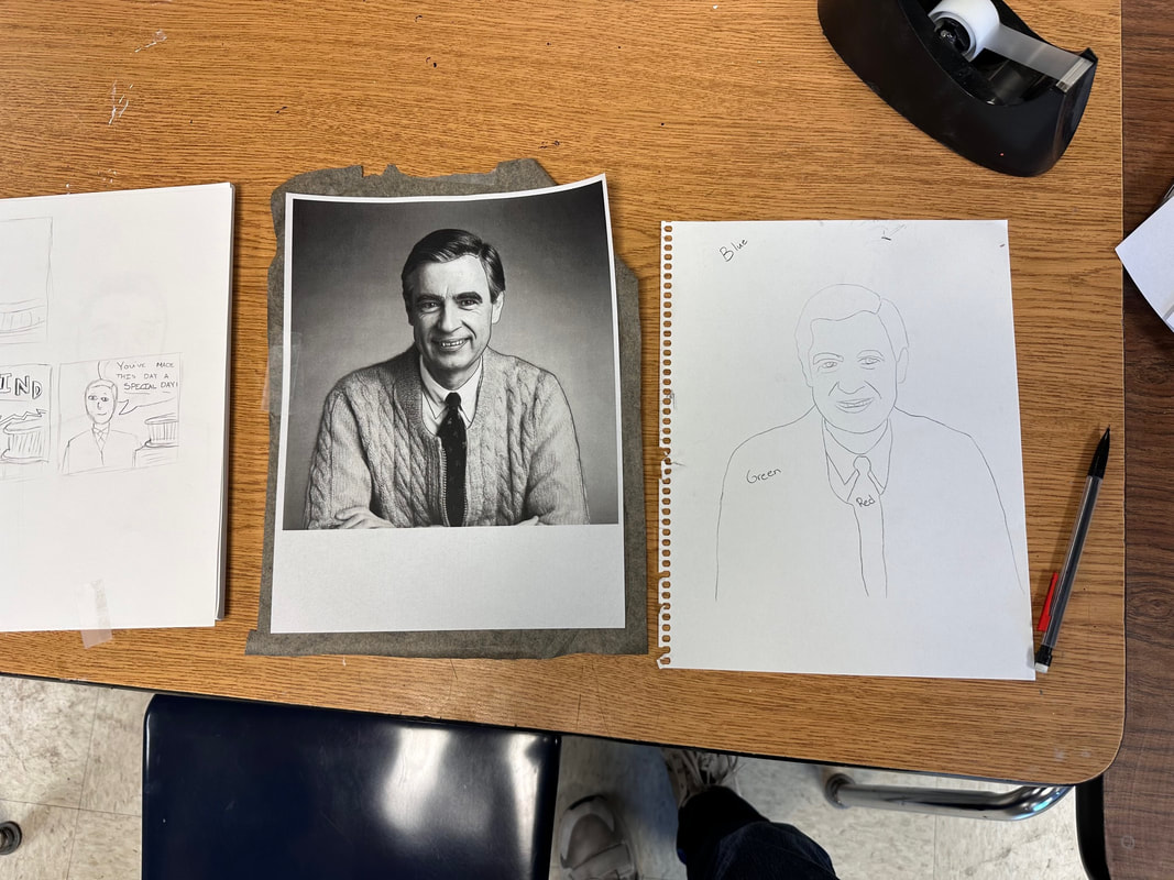
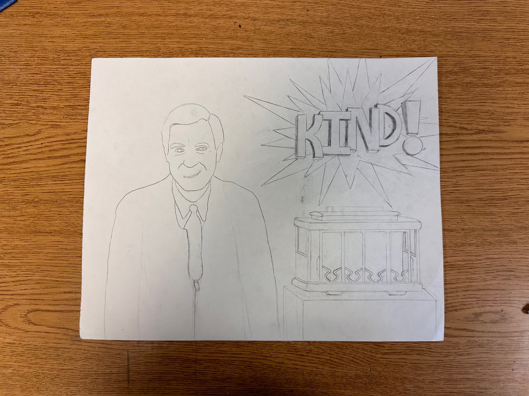
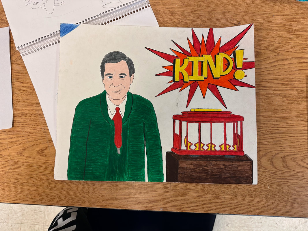
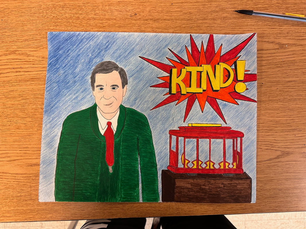
For this project, I entered the world of pop art and learned about different artists and styles that have helped to define that category. Although pop art can take many forms, most artworks tend to portray a figure. I made the decision right away that I really wanted to draw Mister Rogers because I have always considered him one of my biggest role models in life. After I knew Mister Rogers was the individual I wanted to portray, I had to decide which pop art style I wanted to surround him with. I considered doing something related to Andy Warhol's portraits of well-known celebrities. I ultimately decided on Roy Lichtenstein's "comic-book" style of art. I was inspired to use several details from his artwork, including the solid colors and the onomatopoeia sound effect image. However, one thing that I did a little differently was the addition of the word "KIND!" in the shape instead of an actual sound effect. I thought of kindness as Mister Rogers' "super power" in a sense. One part of this artwork I felt like I put a lot of effort into was the trolley. It was a little challenging to make sure perspective and dimensions were applied correctly. One thing I believe I learned or improved upon was using a marker to color instead of colored pencils, which is what I have utilized in all my previous colored artworks. I really enjoyed this project because I was able to take a really bold style of art and combine it with an individual who I've considered very influential in our modern world.
0 Comments
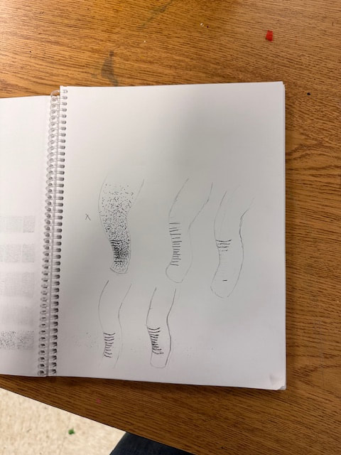
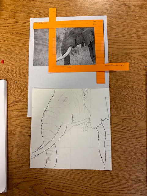
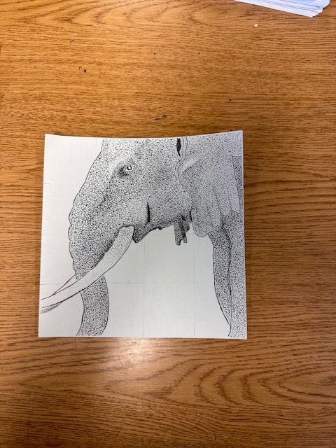
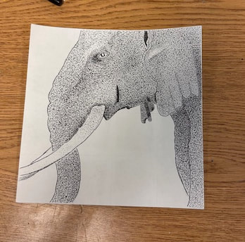
This project was my first experience working with different values, in terms of shading and shadows. It differed from other projects of mine because I did not use colored pencils; instead, I used only a pen. My first task was to pick an image of an object or animal that I could draw and implement value into. I chose a picture of an elephant because I thought it would be a good challenge to try and tackle. After that, the image was printed out, and we used two pieces of paper to "crop" the image into a square. What I find very interesting about value is that you can demonstrate it by quite a few different techniques. I used the stippling technique to show value, which is creating artwork through using simply dots made with a pen. My favorite part of the drawing is probably the head. I think the contrast in value really brings a sense of realism to the artwork. Something I feel as though I learned and improved upon throughout the process was acknowledging which areas should receive darker value or lighter value. However, one thing I could work to improve upon would be to integrate a little more caution regarding certain regions that require darker value, such as applying too dark of a value. Despite this, I am still pleased with how my first artwork utilizing value techniques turned out!
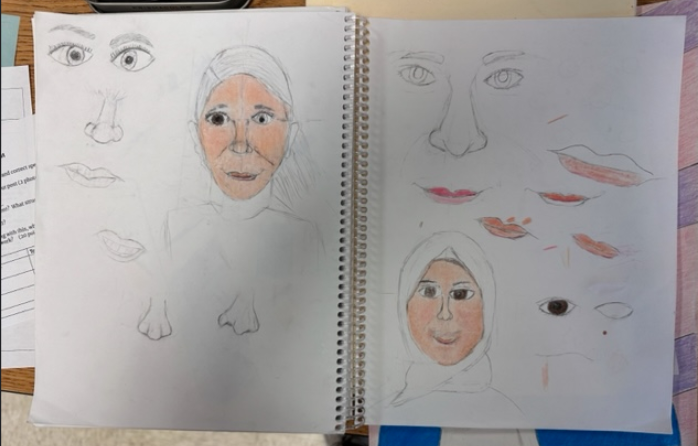
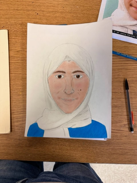
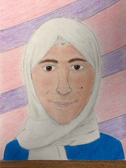
This art project is one that was pretty rigorous, but it paid off tremendously. For this project, I was given a picture of a refugee from Syria, a country struck by war, and I was given the task to draw a portrait of her. We were able to do this through the "Memory Project," which is a nonprofit organization that invites art teachers and their students to create portraits for kids around the world who are facing challenges. Once I received the picture, I began to develop a "relationship" with this person who I had never met before because it helped me understand a sense of empathy towards the person I was drawing, making it so much more important to me. One thing I struggled with the pressure of getting everything right, but I told myself that I didn't have to be so overly critical of myself, as it was my first portrait I had drawn in years. That being said, I was very surprised by just how much I improved in my drawing capacity, such as learning how to make a realistic face with shadows and shading. My favorite part of the project was the gradual process of seeing the portrait come to live with every element, such as the nose, mouth, eyes, pupils, and even the eyelashes! If I had to change one thing, I would probably spend a little more time experimenting with the shadows and creases on the cloth around her head, but I am not dissatisfied with the finished result. I hope the impact of this portrait is as meaningful to the recipient as it was for me.
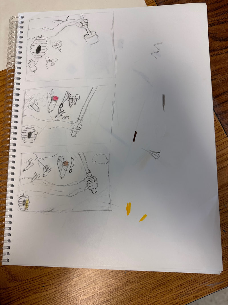
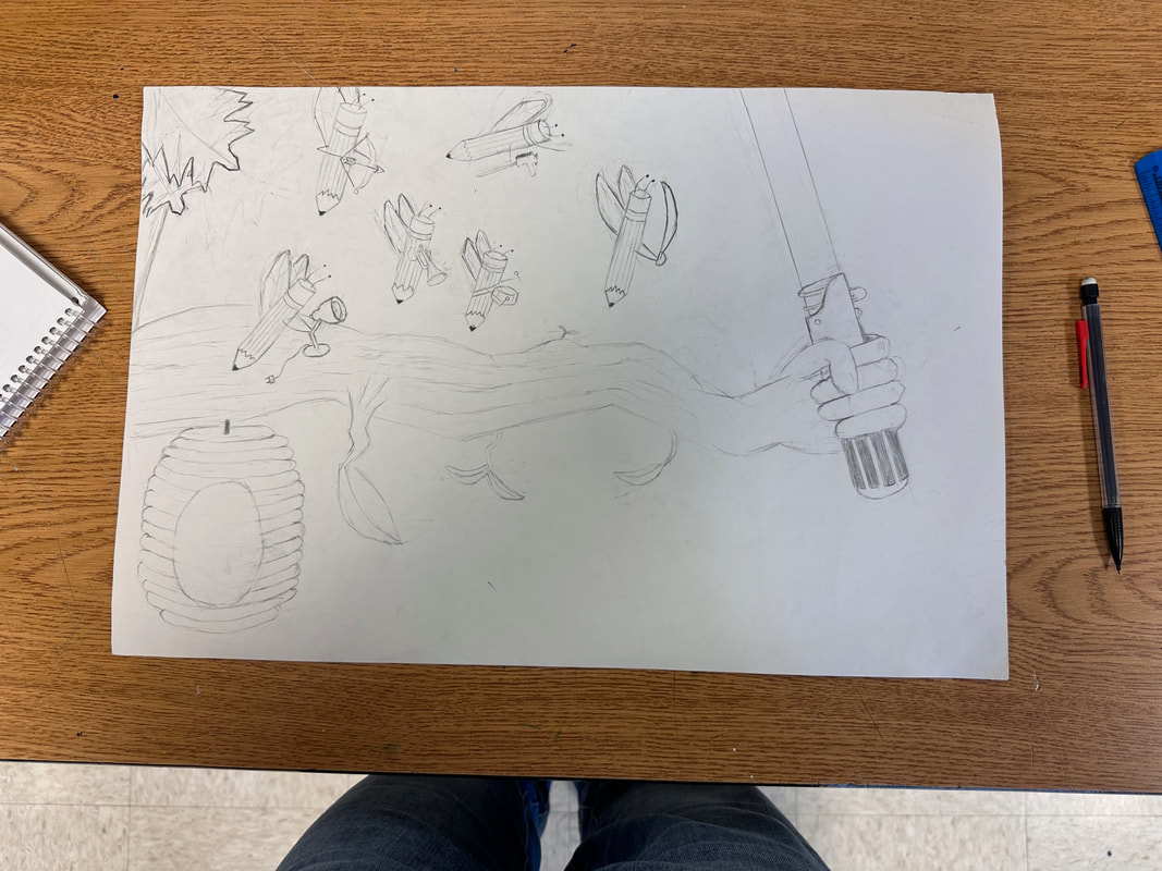
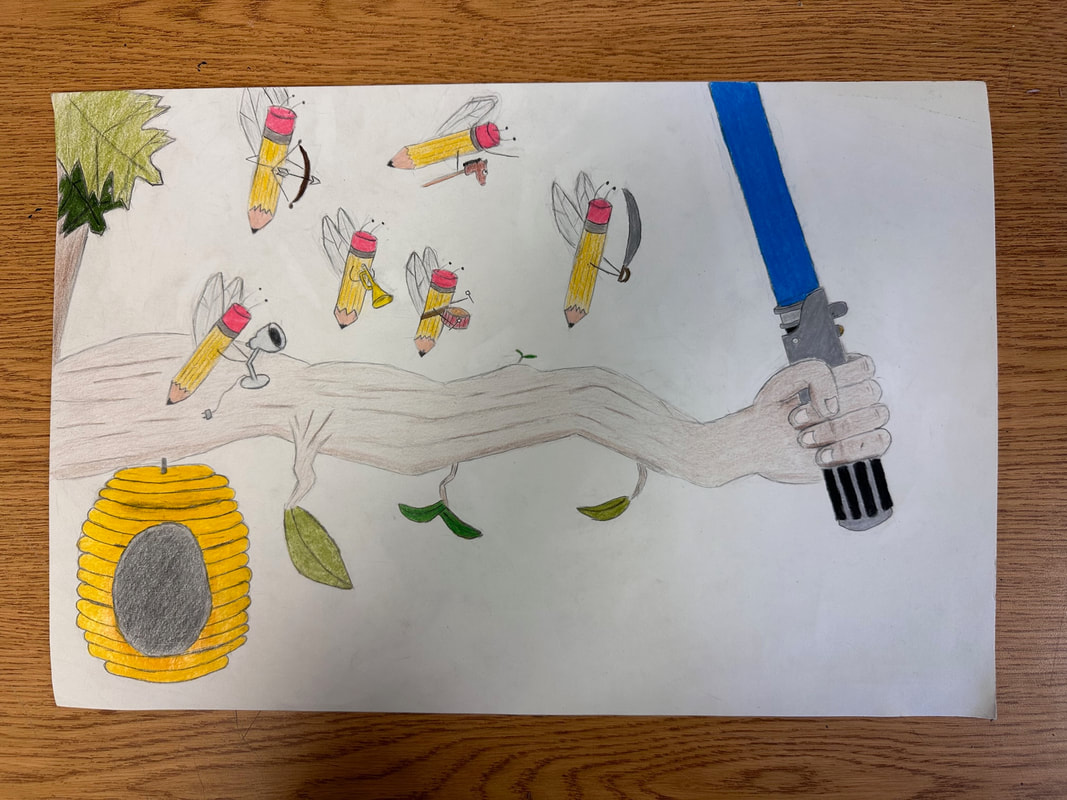
The second project I completed in my drawing class dealt with utilizing ellipses and drawing them to create a scene. Something different about this project was that I had the opportunity to practice with the concept of surrealism. I've realized that surrealism really allows the artist to use their imaginations to a great extent without feeling limited by the boundaries of reality, and I wanted to take advantage of that freedom. For example, I really liked the idea of having a tree branch holding a lightsaber, despite it not making a ton of sense. From that idea, I thought the idea of having some "creatures" preparing to engage the lightsaber in battle was fairly creative. A technique that I needed to learn for this drawing was trying to gradually change the texture of the rough tree branch into a smooth hand. This was a challenge, but I am pretty pleased with the end result. Another thing I was very happy with was how the bee hive turned out. I think the solid gold and orange color pattern really helps to make it pop. If I had the opportunity to change one thing about the drawing, I would want to improve the "bee" wings on the pencils to make their shapes more consistent but their perspectives different. Overall, I think there were several parts about this project that challenged me, but I think they will help to improve me in the long run.
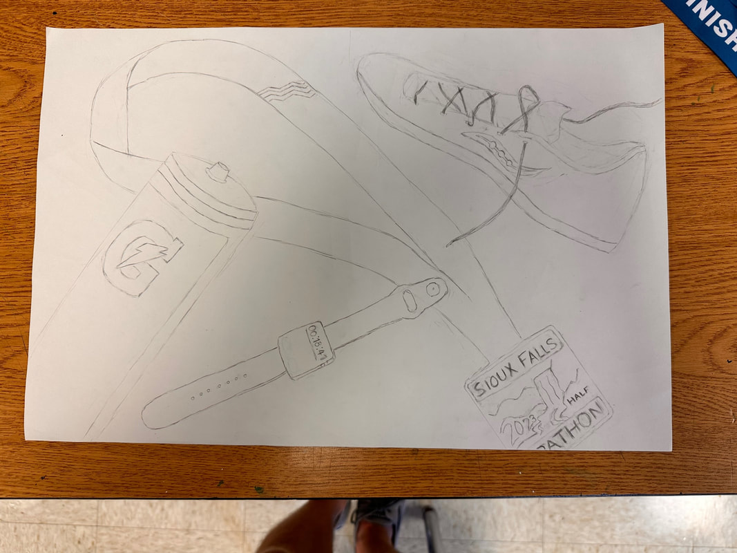
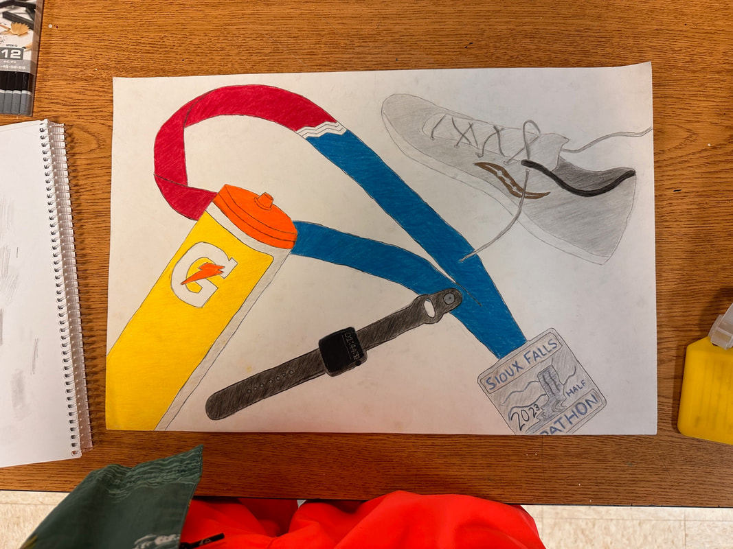
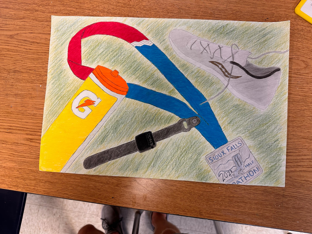
For this project, I created a drawing utilizing contour lines. Contour lines help objects to appear more realistic. The objects I chose to draw were my Gatorade water bottle, a medal I received from completing a half-marathon, one of my running shoes, and lastly, my Apple Watch. I drew all of these objects because they are related in some way to my journey as a long distance runner, which is a big part of my life right now. I thought my drawing skills improved throughout this project because I became more aware of how rough or light I was drawing. This was something I really tried to focus on, especially once I started coloring all the objects in because I wanted my objects themselves to look smooth. I am very happy with how the Apple Watch panned out because I was a little worried how I would be able to make an object that is primarily black look recognizable. I was also very happy with the Gatorade bottle because the smooth, bold colors really help the object pop out. One thing that was a little challenging was trying to figure out which color worked best for the running shoe, so I think I could have experimented with implementing some other shades of gray. Overall, I am very happy with how this project turned out!
|